Study of the Taxi Trip Dataset
Through-out this article we will be analysing trends in taxi usage in New York City. We will see how usage changes during the day-month-year, so get pen and paper ready as, believe me, you don’t want to get stuck in NYC traffic!
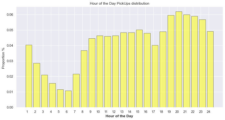
The working day in New York starts at 8:24 on average, we can infer from the taxi hourly distribution that the city wakes up at around 7:00 and keeps busy through-out the day until around 21:00-22:00 when taxi demand starts to decrease. Between 13:00 and 16:00 there is a little peak, as some workers finish working around these hours or start it if they have evening shifts, and others have their lunch break. However, the decrease of demand after 16:00 is caused by the taxis shift change hour, nothing related to the behaviour of the city. After the decrease due to the shift change we can see the biggest peak as most people go home regardless of the reason they were out as it’s bed-time!
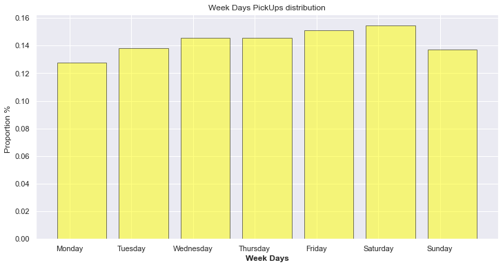
Analyzing the distribution of trips throughout the week we see that Mondays and Sundays definitely have less trips. This is due to the fact that on Sundays people stay at home with their families mostly, whilst on Mondays taxis are used almost exclusively for work related transport as it’s the beginning of the week and there is less social activity. We can also see how on Fridays and Saturdays transport is used to go out with friends and enjoy the weekend. It’s very surprising how the amount of use is highest on Saturday even though most people don’t need to use transport methods to reach their work-place.
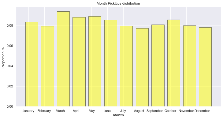
The monthly distribution is also interesting as we can see that in the colder months there are less trips, probably due to people not wanting to leave the comfort of their home to go out and party. We can see that when it starts to get warmer the trend increases to finally decrease again, where we have our minimum in August. In August most people are probably on vacation, taxis aren’t used for work-transport and there are less people overall who utilize them to move around.
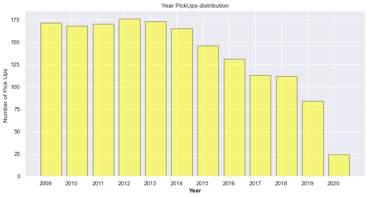
This is the yearly distribution ranging from 2009 to 2020. The main pattern in this figure is the decrease of demand in the last years. This happens due to the entry of new ride-hailing companies in the market in 2014. Apart from that bigger decrease happens in 2020 which is caused by the COVID pandemic. These topics will be discussed later in separate analysis.
Although this is an interactive plot we will give some interesting points to further analyze. In proposing it we are aiming at pinpointing the changes between the hourly distribution on different days. This is most notable between weekdays and weekends. The peak from 8:00 to 9:00 on weekends disappears and also the peak at 19:00 decreases. At the same time the demand for transport increases on the Friday and Saturday nights as people need to reach and come back from the party areas in the city.

Looking at these two images side by side we can see how taxi demand and average speed are inversely proportional. This is clearly due to the fact that in certain moments of the day there is more traffic and congestion, hence the trips take longer.
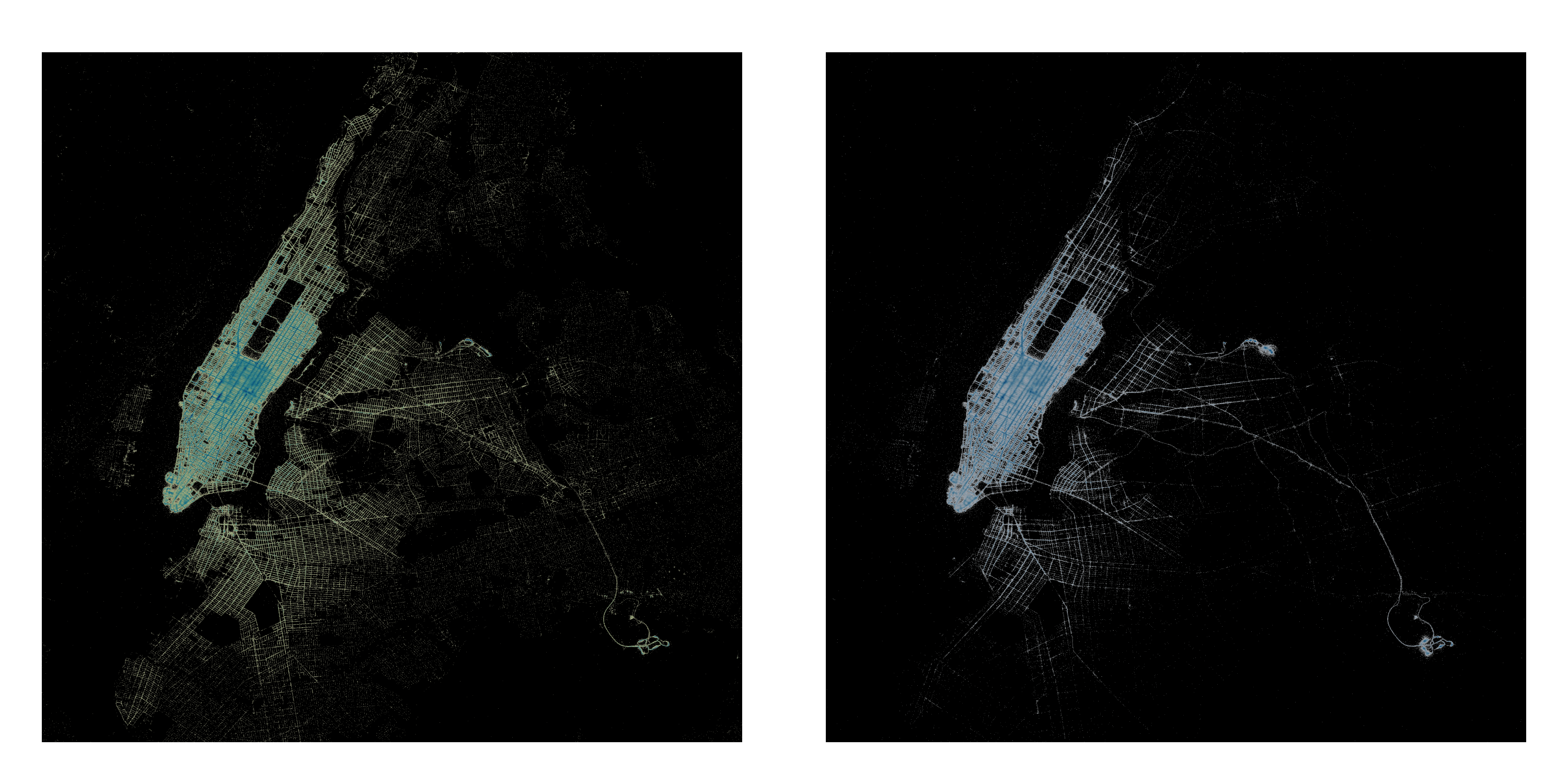
Here we can see the concentration of pick-ups (on the right) and drop-off (on the left) throughout the city. There is a higher concentration of pick-ups in Manhattan and the JFK and LGA airports as people use taxis to head back home after being out. Drop-offs, following the same reasoning are more spread, as people take taxis from the city center and get dropped off all over the city. To wrap everything together, we will let you interact and test your new wisdom about New York taxis, with the following interactive time-lapse Heat-map map.
Below we can see a covariance matrix showing correlation between the variables analysed through-out the article.
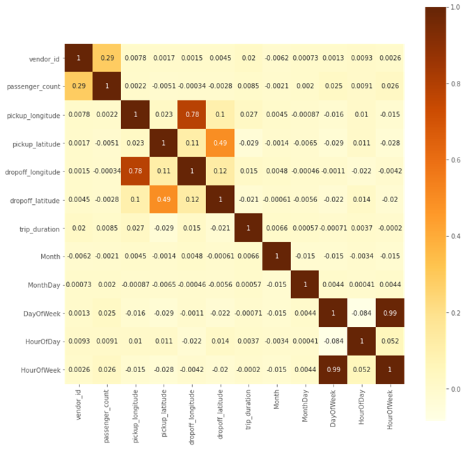
The values that the covariance matrix show are somehow as expected. Manhattan is longer in the latitude than in the longitude axis. Which means that the variation between pickups and dropoff latitude is bigger, so that brings to less correlation. Being a coefficient of 0.49 for the latitude and 0.78 for the longitude. It is interesting to observe the influence of each variable on trip_duration. The correlation is small in general, since there is a lot of variance. There is however a lot of different variables that have influence on how much it takes the taxi to arrive to destination. If we look at the figure we can observe which variables have more influence. Vendor_id has the biggest influence, out of the raw data. From the time variables, it can be seen that month and hour of the day have more influence than day of the week. This to be expected, as the week distribution was stable. And as anyone can imagine latitude and longitudes play a big role too.
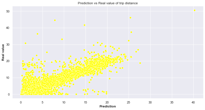
After analysing the correlation matrix, we modeled a Random-Forest Algorithm to see if it possible to predict the distance of a trip with regards to the variables mentioned before, and the result is fairly good. Considering that it was a Kaggle competition in 2017 worth 30000$. Who knows… maybe we lost the opportunity of having a very good holiday. The figure below shows the scatter plot of the predictions versus the real values. We can see that the points are concentrated in the diagonal showing that most of the predictions were close to the real value.
We will further analyse the data-set in the other articles provided on the website, see you there!